Roman Epigraphy
As a visiting artist at The American Academy in Rome in 2022, I walked the roads and piazzas of the city of Rome in my search for examples of epigraphy. Numerous photographs of examples were taken and their exact locations were geotagged. 320 of those were selected for inclusion in this publication. Each example was chosen because I felt it was meaningful and culturally significant, and then they were carefully drawn in the manner of a traditional epigrapher.
At the Academy, I was able to consult with historians, librarians & scholars who offered me guidance on my approach to recording epigraphy.
My goal was to explore the contemporary layer of communication that rests upon the city's surface and give voice to the everyday Romans and myriad visitors who have left their mark upon the city—to memorialize the mundane and give voice to individuals largely ignored in the historical record. I aim to act as a sort of cultural preservationist documenting the shift from ancient Roman typography engraved upon the facades of imperial structures, to the centuries-old tradition of craftsman designers creating unique typefaces and signage for shopkeepers in the 19th and 20th centuries, to our present landscape of graffiti and tagging that dominates the epigraphic landscape.
The book was designed and printed in 2024 during my residency at the Scuola Internazionale di Grafica Venezia and Tipoteca in Cornuda Italy. At the Scuola, I collaborated with Cristina Zanato on the Risograph printing of the interior and with Daniele Fachin at Tipoteca on the letterpress printing of the cover. Daniele also bound the book.
A poster featuring a unique typeface designed by Cristina Zanato, Jan Møller and myself, based on one of the typographic examples in the book, is included as a poster.
Please contact me for sales.
Published by Object Editions, 2024
Limited Edition of 30 signed copies.
160 Pages
21 cm x 29.4 cm (8 1/4 ” x 11 5/8”) closed format
Risograph printed interior
Letterpress printed cover
Swiss binding
Risograph printed poster
$250.00
Roman Epigraphy is in the following collections
Letterform Archive, San Francisco, California
Bancroft Library, University of California, Berkeley, California
Stanford University Rare Books Collection, Stanford, California
Rare books collection at the J. Willard Marriott Library, University of Utah, Salt Lake City, Utah
Tipoteca | Museo della Stampa e del Design Tipografico, Cornuda, Italy
“The Romans, who went down in history for covering Italy and Europe with roads, also enjoyed covering everything they came across in writing.” Giuliano Tedesco, 2001
“...the soil of Rome being stocked to a great depth with words, bits of architecture and sculpted limbs, tombstones and all the other compost of civilized time...” Eleanor Clark, Rome and a Villa, 1950
“When graffiti are found in large numbers in one and the same place they gain the importance of a historical document.” Lanciani, 1891
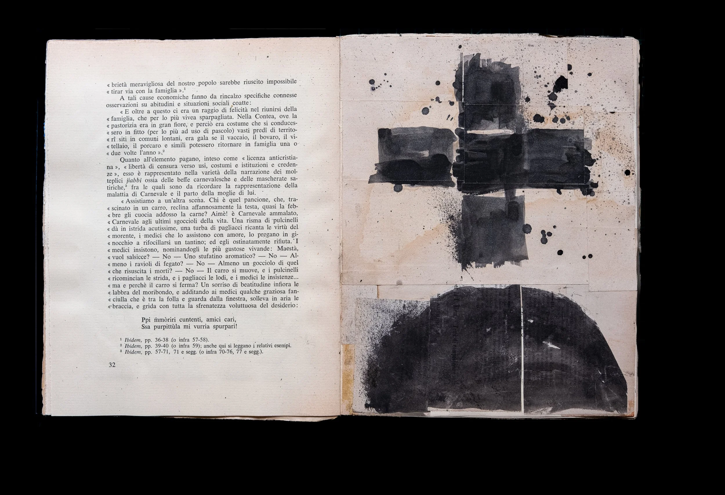
Marginal Landscapes
In my cyanotype series Marginal Landscapes, I explore the ephemeral marginalia left by anonymous readers on the printed page. These delicate contact prints—made by placing books and negatives directly onto light-sensitive paper and exposing them to sunlight—echo the fragility of the printed book itself in our digital age.
The prints derive their power from the interplay of thoughtful commentary, underlined passages, dots, and stars as they engage with literature's canonical texts. Many pages have been written on repeatedly, transforming them into palimpsests where multiple readers leave traces, creating new meanings through accumulated dialogue.
Through deliberate page selection and juxtaposition, I construct unexpected relationships from disparate texts in each photographic cluster. Drawing from an archive of hundreds of annotated volumes collected since 2008, the series transforms readers' intimate traces into impressions that reveal both the fragility and enduring power of human engagement with the written word.
Toned Cyanotype on Fabriano artistico, hot press, extra white, 140 lb
2026
Various dimensions
The Pages Project digital archive
This online archive of book pages bearing marks, notations and other marginalia was launched in 2013 and is based on a vast archive of marginalia that I started to construct in 2008. The Webby award-winning Pages Project explores the act of reading, each reader’s unique relationship to the material, and the nature of the book as a transitory physical object in a digital age.
The Pages Project will soon be released as a printed publication.
The project has been featured by:
The New Yorker
Mashable
FastCompany
HOW: Top 10 Websites for Designers
Yahoo Tech
Adobe Tumblr
Mental Floss
The Huffington Post
The Global Digital Citizen Foundation
Tech Sources
El Pais
O Magazine
Sketch Book
In a Palermo bookstore, I found an old book printed on laid paper with untrimmed pages—intonso, untouched. I transformed it into a traveling sketchbook, responding to marks and symbols encountered in the landscape.
Working with found printed materials, gouache, ink, and graphite, I trimmed each page before beginning. When I reached the book's end, the project concluded.
Sketch Book
Collage and mixed media
2025
10” x 7.75” page size
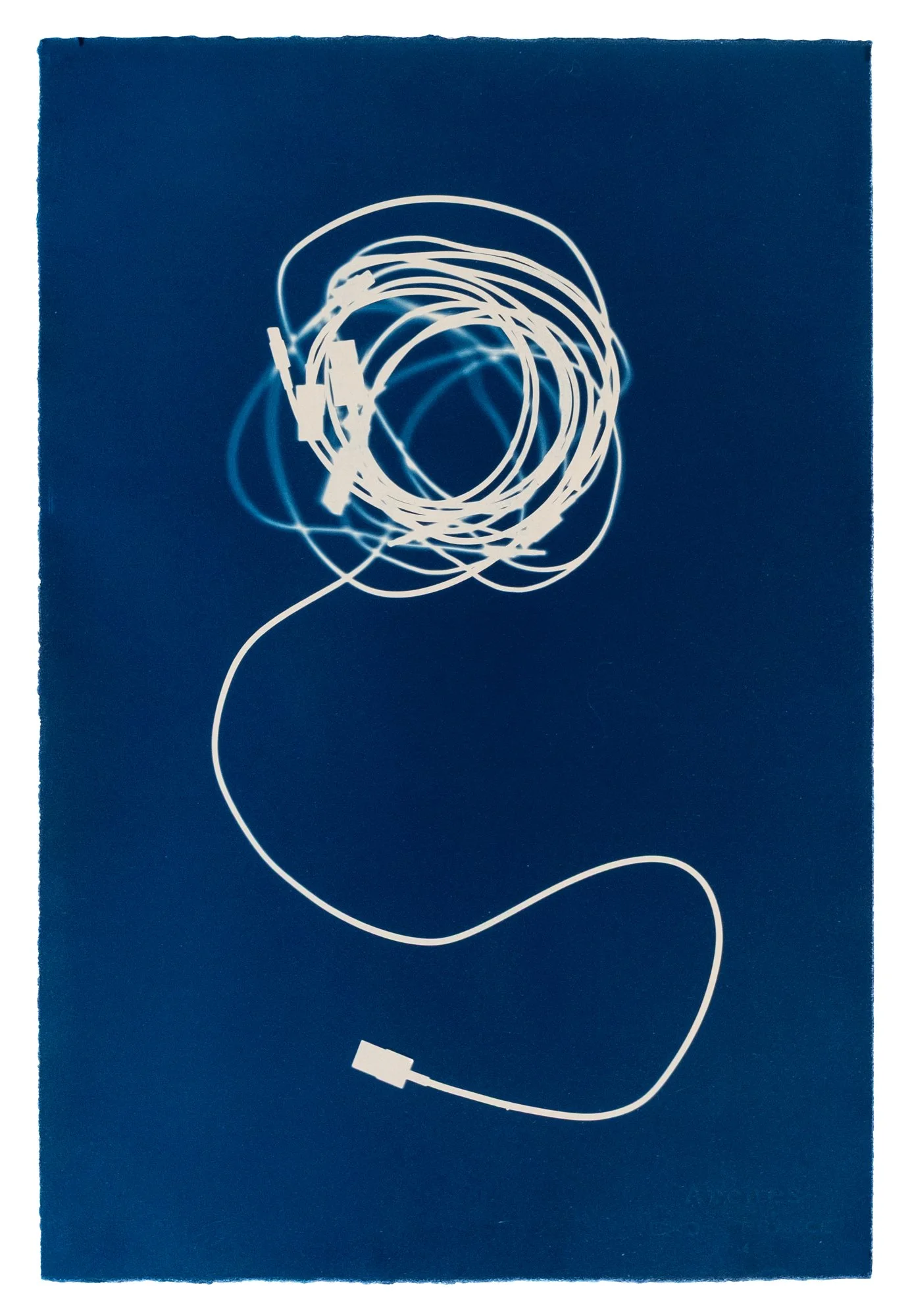
Dump
DUMP
Sealed and surfacing
dispersed and drifting
Walking at Cesar Chavez Park in Berkeley, I began to notice objects emerging from the soil — decorated porcelain fragments, colored glass shards, rusted pipes, bones, the residue of mid-century domestic life pressing upward through clay and earth. The park sits atop a 90-acre landfill that the city of Berkeley operated from the mid-1950s until 1983, when it was capped with soil and clay and converted into open space. The garbage was sealed beneath the surface, made invisible, the problem of disposal resolved by concealment.
But the land refuses this arrangement. Ground squirrels and other rodents excavate into the soil, and the buried objects follow their tunnels upward. Seasonal movement does the rest. What was sealed is surfacing.
When I discovered a map revealing the landfill's organized waste zones — concrete debris, household trash, foundry waste — my walks through the park changed. I began documenting where each object emerges across the site, building a picture of what was buried where, and what the land is choosing to return. These objects are ambassadors from a specific historical moment, the full flowering of American disposable culture, randomly selected by animal behavior and geological pressure and delivered to the surface without curatorial intent.
To make these works I place the objects directly onto cyanotype-coated paper and expose them to light. There is no camera, no negative, no translation. The object makes its own impression. This directness feels essential — the work is about what cannot be hidden indefinitely, and the process refuses to interpose anything between the thing and its image.
From this origin the work expanded into the broader Bay Area landscape, following garbage that moves differently — windblown, roadside, dispersed across the terrain without burial or concealment. If the Cesar Chavez material is sealed and surfacing, this is dispersed and drifting — waste in open circulation rather than compressed archive.
Cyanotype prints
Arches Aquarelle 140 lb
Square prints 22” x 22”
Horizontal prints 22” x 15”
Market Street Prototyping Festival Public Art
For three days in April 2015, San Francisco’s Market Street was the site of the Market Street Prototyping Festival, which transformed the area into a public platform, showcasing exciting ideas for improving our famed civic spine and how we use it. Our design, Street Sketch, was one of 50 designs selected from over 200 entries from around the world.
The project was a partnership between the San Francisco Planning Department, the Yerba Buena Center for the Arts, and the Knight Foundation.
The core of the 12 x 12 ft. structure was a free standing wall. The wall’s sidewalk-facing side served as the primary drawing surface, while the other three sides contained information about the project that encouraged people to be a part of the San Francisco creative community. This wall also created a barrier between the traffic along Market street. The chalk surfaces were devoted to drawing, generating a welcoming sense of place and made the area more conducive to social interaction.
The structure was constructed using volunteer work from peers and students from San José State University and California College of the Arts.
Based on the prototypes success it was selected to become a permanent structure in San Francisco and a new prototype was designed. The goal of the new design was that it be more sculptural, be able to withstand the elements, and accommodate visiting artists who would periodically paint murals on its surface.
Tokens
My Tokens series emerges from years of documenting cryptic marks—graffiti, marginalia, urban signage—discovered on city surfaces and within found books worldwide. These minimal sculptures give physical form to humanity's persistent urge to mark and communicate.
Drawing from my archive of photographed and sketched markings, I transform two-dimensional expressions into three-dimensional objects, asking viewers to reconsider the anonymous human communication we encounter and largely ignore daily.
The work is deeply informed by paleoanthropologist Genevieve von Petzinger's discovery that Ice Age cave artists used a consistent vocabulary of 32 geometric symbols across Europe over 30,000 years—dots, lines, spirals, hand stencils—humanity's oldest known acts of creative expression. This ancient symbolic language connects directly to today's urban marks, revealing continuities in how humans claim space and transmit meaning.
My multidisciplinary practice rejects boundaries between art, design, and craft. Years of creating iconic symbols as a graphic designer inform this investigation into mark-making's primal power. Tokens finds artistic beauty in these humble forms while revealing their creative potential, connecting cave painters to contemporary taggers in an unbroken chain of human expression.
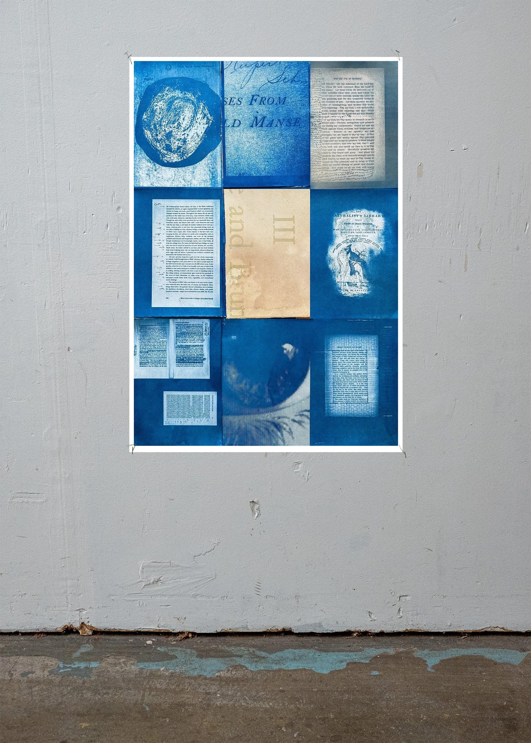
American Bauhaus
In 1992, as a design student, I attended the reunion of Black Mountain College in San Francisco. The school is credited with shaping some of the greatest artists in American history: Willem de Kooning, John Cage, Ruth Asawa, Merce Cunningham, Buckminster Fuller, Franz Kline, and Robert Rauschenberg among them.
I took extensive notes that day as former students and teachers recounted their experiences at the school. The quotes I gathered that day are the foundation of this publication.
The book offers a uniquely personal perspective on this legendary school and the thoughts and experiences of these fascinating and influential people.
Each quote has a page devoted to it. The quote is presented in its entirety along with the time it was uttered. A fragment of the quote is also reproduced at a large scale bleeding off the edge of the page and traveling onto the following spread. In essence, it is an evocation of the interplay of the conversation that took place on that day.
The book contains unpublished images taken on the day of the reunion as well as archival images from my personal collection.
American Bauhaus is available here from Slanted Publishing
American Bauhaus in Collections
Robert B. Haas Family Arts Library | Yale University, New Haven, CT
Franklin Furnace Archive, New York, NY
Museum of Modern Art / Artists' Books Collection, New York, NY
Kunstbibliothek Sitterwerk, St.Gallen, Switzerland
Black Mountain College Museum + Arts Center (BMCM+AC), Asheville, NC
Letterform Archive, San Francisco, CA
North Carolina State University, Raleigh, NC
Environmental Design Library, University of California, Berkeley, CA
Problem Library, San Francisco, CA
San Francisco Center for the Book, San Francisco, CA
Museum of Contemporary Art Detroit - MOCAD, Detroit, MI
Media coverage
Printing: Black spot color on the interior. Black plus white silkscreen on the cover.
Cover paper: Meta Paper EcoFibres Jute 300 g/sm
Inside paper: Meta Paper Extra rough warm white.
Volume: 108 pages
Format: 7" × 10" (17.78 cm × 25.4 cm)
Language: English
Delivery: Wrapped in shrink foil, packed in box envelopes, shipped with tracking number
Content and Design: Erik Schmitt, Berkeley, California, USA
Publisher and Distributor: Slanted Publishers, Karlsruhe, Germany
Printer: Stober Medien GmbH, Eggenstein, Germany
40 Blows
While exploring ancient art in European museums, I’ve often been struck by a recurring feature in classical sculpture: the damage. The heads of gods, emperors, and everyday people are frequently defaced—noses smashed, chins broken, cheeks gouged, and crosses carved into brows. Yet museums often provide little context for these disfigurements.
In recent years, scholars have increasingly focused on the religious upheavals of late antiquity, especially the rise of Christianity and the iconoclastic waves that accompanied the fall of the Roman Empire. Their research has revealed how sculptures, architecture, and even texts were systematically altered or destroyed to suppress pagan imagery and ideology.
The photographs in this book—taken over many years in museums across Europe—document these damaged faces. They stand as quiet witnesses to a long and often violent history of transformation, belief, and erasure.
This hand-bound softcover booklet features a newsprint interior and a pigment-printed cover on metallic stock.
40 Blows
Inkjet printed on newsprint. Hand-bound.
2024
7” x 10”
Gilded Cities—Yerba Buena Center for the Arts Fellowship
“Gilded is not golden. Gilded has the sense of a patina covering something else. It’s the shiny exterior, and the raw underneath” —Historian Nell Irvin Painter
Gilded Cities is an outgrowth of work I completed as a fellow at the Yerba Buena Center for the Arts in 2018. As part of the fellowship, I explored displacement within the city of San Francisco.
Spurred by this work, I developed Gilded Cities to explore the fact that the San Francisco Bay Area has become an enclave for the rich—unattainable to all but the most privileged. Nine utilitarian objects throughout the Bay Area (such as sewer plates, water pipes and manhole covers) were gilded in 23 karat gold. The objects often have text associated with them that serves as a reminder of the basic services necessary for survival surrounding us that are largely taken for granted: water, sewer, electricity etc.
The project also contained echos of historic events in the convulsive history of the area. For instance the birth of San Francisco in the gold rush and the use of the term Gold Mountain by Chinese immigrants to describe the city.
An immersive website has also been created by developer Nick Bushman. It allows people to view the objects online, or to map their locations and visit them.
The project became part of the national and local conversation about displacement in the San Francisco Bay Area and received the following press coverage:
Gilded
24 karat gold on found objects
2018
Various dimensions
Ajo
“I got sick of living around people with money”
Ajo Arizona sits a few miles from the Mexican border and is one of the most isolated and inhospitable towns in America.
Dwellings there are shaped by the intense heat—homes have windows covered in aluminum foil to reflect sunlight, their wood siding buckled and warped. The town “cemetery” consists of graves covered in concrete shoveled into primitive mounds, crosses etched on the surface. A massive abandoned open-pit mine, formed of concentric rings that recede into the Earth's surface, culminates in a black pool. The water and air are tainted with poisons from the operation of the mine.
A man's house sits within this landscape. After his death, I sifted through thousands of artifacts, journal entries, and photographs there—evidence of a life serving in the U.S. military, working aboard biological research vessels in the Caribbean, studying art at the legendary experimental school Black Mountain College, working as a US Forest Ranger, and teaching college.
The juxtaposition of images of the impoverished, otherworldly environment, the desert landscape, and objects found in the house that evidence a rich and interesting life seem incongruous. Found journals containing quotes like “I sleep a lot and do not work in the evening. If I was someone’s horse they would probably take me out back and shoot me.”, capture an increasingly disturbed state of mind, as well as chaotic goings-on in the community. “A week ago Thursday one of my friends, Allen, was stabbed in the stomach by his girlfriend/business partner Ramona. He has been in critical care ever since he went to the hospital. He is a gentle quiet hard-working man”. These journal entries are woven together with images of items found inside the house: wooden boxes of insects mounted on pins, a ziplock bag labeled “ELAINES ASHES”, and notes taped to walls, one saying “SOMEONE HAS STOLEN 19 PILLS OF HYDROCODONE.” as well as images of the desert landscape and the town, suggesting the unpredictability, mystery, and harshness of life.
Ajo is a dialogue between a series of found photographs and journal entries documenting the historic arc of a life, juxtaposed with images from the time when they were found—a meditation on the passage of time, and the shifting nature of one person’s reality.
This project was a Photolucida Critical Mass finalist in 2022.